
What is GIS?
Making sense of complex technology
The Project
Client
Esri
Role
Art Direction, Motion Design, UX/UI, Visual Storytelling
Deliverables
Concepts, Pitch Decks, Wireframes, Prototypes, Storyboards
Awards
Best Branded Content Site – B2B | 2025 Digiday Content Marketing Awards
Gold Addy | 2025 American Advertising Awards
The Goal
Explain what GIS is – clearly.
Esri is the global leader in GIS software, but even their own users struggles to explain what GIS actually is. The old site was overloaded, jargon-heavy, and designed to show too much technical detail, leaving new audiences confused.

Storytelling & Motion Design
I developed 8 short animations that break down key GIS concepts without watering them down. That meant storyboarding content that could speak to decision-makers and newcomers without losing either audience.
Web
Users told us the old site was dense and information was overwhelming. In this redesign, my goal was to give content room to breathe, presenting ideas at a comfortable cadence.

-
People were less bored
In the first 90 days, bounce rate decreased by 23%. The amount of time spent per page increased by 45%.
-
People were more curious
Site visits increased by 97% in 90 days, adding hundreds of thousands of visitors.
Advertising
The work behind the work
This wasn’t just a website. It was a chance to reframe how a 50-year-old tech company tells the story of its core technology.
In addition to leading the design, I facilitated cross-functional workshops, delivered executive pitches, and kept the team aligned and energized through a complex, months-long effort.
Here’s how I led the team.
-
Facilitated cross-functional workshops and brainstorms to clarify the abstract problem space.
Created pitch decks and storyboards to gather executive buy-in early, setting a clear direction before production began.
Challenged legacy beliefs about how GIS “should” be explained by proposing a simpler approach, even though it went against internal norms
-
Led the concepting phase with early moodboards, wireframes, and storyboards that determined the visual direction and tone.
Defined the visual strategy and stories for all animations and illustrations, partnering with internal motion designers and UK-based studio 422 South.
Oversaw design consistency across every touchpoint–web, animation, and post-launch advertising.
Set a new tone for brand storytelling within Esri’s digital ecosystem.
-
Gently (and sometimes not-so-gently) redirected the team away from reused solutions and back toward user-centered thinking.
Used research as a guidepost to keep pushing toward better, clearer outcomes, especially as the going got tough.
Leaned on my teaching experience and applied knowledge about how people learn new ideas to inform content and design decisions.
Design Strategy
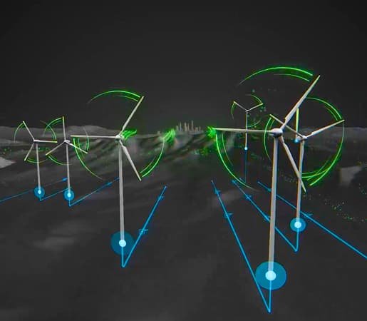
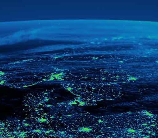
Typical GIS graphics are maximalist compositions of layers and data. In order to simplify the visual message, I removed any details that weren’t critical to the main idea. All maps and backgrounds are muted, monochromatic, and dark, making GIS data vibrant—the visual hero.


Before and After
All research participants struggled with jargon, content density, and complexity. They weren’t able to quickly ascertain how GIS would be applicable in their organization.

Defining the Problem
A UX analysis of the old What is GIS? site revealed that the order and detail of content was part of the problem. The information wasn’t clearly communicated, verbally or visually.
“If I had no awareness of what GIS was, this (definition) gives me a high level understanding . Would I understand it right out of the gate from reading that? Probably not. Until I actually did something with the product that light bulb moment would never happen for me.”
“First thing I saw was this little picture up here which to me doesn’t describe anything. Looks pretty but it doesn’t give me any more information.”
Motion Strategy
We distilled the definition of GIS (the intro videos) into a three-part explanation that would be effective for a broad audience. To make sure the visuals were as effective as possible, I created storytelling frameworks like the one below that define the visual language based on using universal symbology.

Progression of Fidelity


Storyboards
I created storyboards for all animations for What is GIS like the ones below. I had the amazing opportunity to work with Dan Gill at Esri and 422 South, a motion graphics studio in the UK, to bring these stories to life.


Full Credits
Art Direction: Amanda McKinley
UX UI: Amanda McKinley
Creative Direction: James Hitchcock, Carl Bender
Storyboarding: Amanda McKinley
Video Production: Peter Stonier, Will Kirkley, Travis Barton, Rachel Ortiz
Motion Graphics Production: 422 South, Dan Gill
UX Research: Adam Williams, Ali Khalid, Alex Smailes
Cartography Consultant: Nick Bauch
Copy: Andrea Massey
Front-end: Joe Savella